

The Best 404 Error Page Designs You Need to See
Have you ever clicked on a link and ended up on a page that says “404 Error – Page Not Found”? It can be frustrating, right? But here’s the thing—websites don’t have to make 404 pages boring. In fact, many brands turn these pages into fun, creative, and useful experiences for their visitors.
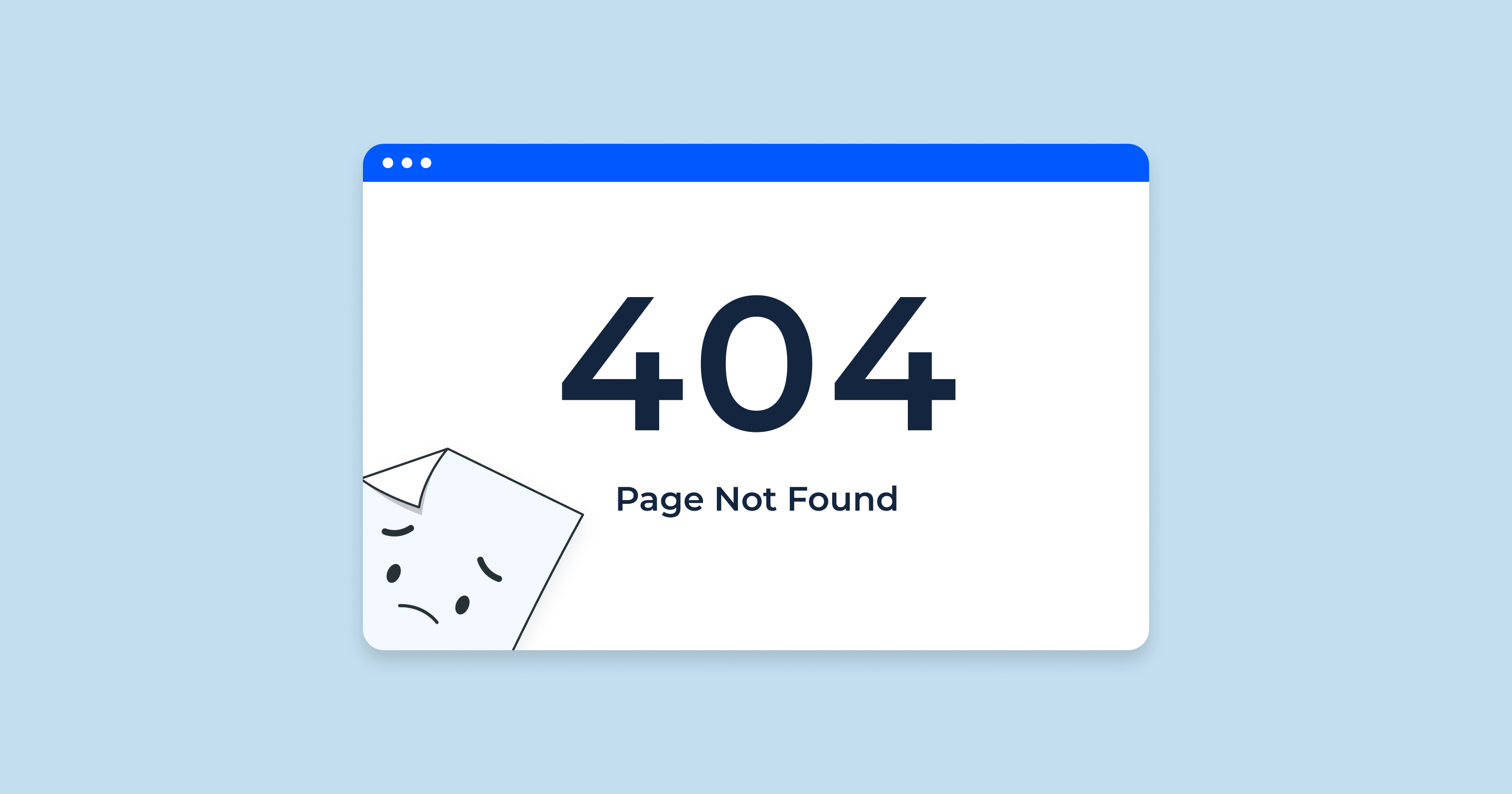
A 404 error page appears when the page you’re trying to visit doesn’t exist. This could happen if the link is broken, the page has been deleted, or you typed the wrong URL. Normally, it’s a dead end—but a smartly designed 404 page can actually keep users on your site instead of losing them.
In this guide, we’ll explore:
-
Why 404 pages are important for your website.
-
What makes a great 404 page.
-
The best examples of creative 404 error page designs.
-
Tips for designing your own.
-
Common mistakes to avoid.
Let’s dive in!
Why 404 Error Pages Are Important
A lot of website owners ignore their 404 page, but it’s actually a very important part of user experience (UX). Here’s why:
Keeping Users Engaged
When a visitor lands on a boring 404 page with nothing useful, they might just leave your site. But if you have an engaging and helpful 404 page, you can guide them back to your main content. For example, you can add:
-
A link to your homepage.
-
A search bar.
-
Popular or recommended articles.
This way, instead of closing the tab, they keep exploring your website.
Strengthening Brand Personality
A 404 page is a chance to show your brand’s voice and personality. You can use humor, clever writing, or a creative image that fits your style. This helps make your brand more memorable, even in an “error” situation.
For example:
-
A pet store might say: “Oops! Looks like this page ran away with the dogs.”
-
A tech brand could say: “Error 404 – Our robots couldn’t find that page.”
Improving Website Usability
An effective 404 page is not just about looks—it also helps users find what they need. That means having:
-
Clear navigation.
-
Links to important categories.
-
A search option to quickly find the right page.
Key Elements of an Effective 404 Error Page
To create a great 404 page, you need to think about both design and functionality. Here are the key elements:
Clear Message
Your visitors should instantly know that the page is missing. Use simple language like:
-
“Oops! We can’t find that page.”
-
“404 – Page not found.”
Avoid technical jargon like “HTTP 404 – Not Found” without explanation.
Engaging Visuals
Images, illustrations, or even animations can make the 404 page feel less frustrating. For example:
-
An illustration of someone looking for something.
-
A funny animation related to your brand.
Navigation Options
Never leave your users stranded. Include:
-
A button to return to the homepage.
-
Links to popular or trending pages.
-
A search bar to help them find content.
Call-to-Action (CTA)
Encourage visitors to take the next step. Examples:
-
“Go back to our homepage.”
-
“Check out our latest articles.”
-
“Explore our product range.”
Brand Consistency
Your 404 page should match the overall look and feel of your website. Use the same colors, fonts, and style so it doesn’t feel out of place.
The Best 404 Error Page Designs You Need to See
Let’s look at some amazing 404 page designs from around the world.
Funny & Playful 404 Pages
1. Lego
Lego’s 404 page shows a Lego character looking confused, with a playful message. It’s colorful, fun, and perfectly matches their brand.
2. Pixar
Pixar’s 404 page features the sad little lamp from their famous intro. It’s adorable and makes you smile instantly.
Minimalist & Elegant 404 Pages
3. Dropbox
Dropbox keeps it simple with a clean white background and a minimal illustration. It’s calming, easy to read, and focuses on navigation.
4. Mailchimp
Mailchimp’s page uses simple typography and clear links, but still adds a quirky brand touch with a small illustration.
Interactive & Gamified 404 Pages
5. Google’s Dinosaur Game
If you’ve ever lost internet while using Google Chrome, you’ve seen the little dinosaur game. It’s a mini-game that keeps you entertained until you’re back online—proof that errors can be fun.
6. Kualo Hosting
Kualo’s 404 page lets you play a space shooter game while you’re on the page. It’s unexpected and keeps users engaged.
Storytelling 404 Pages
7. GitHub
GitHub’s 404 page shows an image of an “Octocat” in space, hinting at a lost astronaut. It feels like part of their larger brand story.
8. IMDb
IMDb uses movie quotes related to being “lost” or “missing.” It’s creative and fits perfectly with their movie theme.
Creative Animation & Visual Effects
9. Airbnb
Airbnb’s 404 page features soft animations of travel scenes. It’s peaceful, engaging, and very on-brand.
10. Blizzard Entertainment
Blizzard’s 404 page includes animated characters from their games, making it exciting for fans.
Tips for Designing Your Own 404 Error Page
If you want to create your own effective 404 page, follow these tips:
Keep It On-Brand
Match the tone, colors, and visuals with your brand identity. If your brand is playful, add humor. If it’s professional, keep it sleek.
Make Navigation Easy
Your goal is to guide visitors back to a useful page. Always include:
-
Homepage link.
-
Search option.
-
Important categories.
Use Humor or Surprise
A little humor can turn frustration into joy. Just make sure it’s appropriate for your audience.
Optimize for Mobile
Many visitors will land on your 404 page from a phone. Make sure the design is responsive and loads fast.
Test & Update
Check your analytics to see how many people land on your 404 page. If bounce rates are high, improve it.
Common Mistakes to Avoid in 404 Page Design
Even the best brands can make mistakes. Avoid these:
-
No navigation or search – Don’t trap your visitors.
-
Overly complex animations – They can slow down the page.
-
Generic text – “404 Page Not Found” without anything else feels cold.
-
Not mobile-friendly – A bad mobile layout can drive users away.
-
Ignoring SEO – Use proper meta tags so search engines know it’s a 404 page.
Conclusion
A 404 error page doesn’t have to be a bad thing. In fact, with the right design, it can:
-
Keep users engaged.
-
Show your brand’s personality.
-
Improve your site’s usability.
From funny illustrations to interactive games, there are endless ways to make your 404 page stand out. The key is to make it clear, helpful, and consistent with your brand style.
Remember, mistakes happen—links break, pages get removed—but with a great 404 design, you can turn an error into an opportunity.
